By now you’ve probably seen the thousand or so stories criticizing Apple’s new Maps app in iOS 6. As this is sure to be the Apple scandal of 2012, right up there with “antennagate”, I think I’ll leave it to others to write up their own personal disaster stories. You’re probably bored of that already.
Instead, I want to talk about what I think is a much bigger problem for Apple: the iOS Clock app for iPad.
Now, bear with me; I know you probably get a heck of a lot more use out of Maps than an alarm clock, and I’m sure that in the scheme of things, Clock was the least of Apple’s worries for this release. But see, that’s the problem.
It’s not the Clock app itself, but rather what the Clock app on iPad represents—an Apple software division that’s overstretched and off its focus.
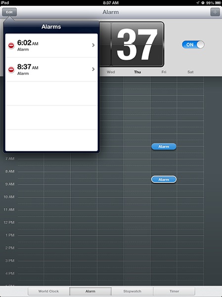
Take a look at exhibit A:

In this picture, you can see that I have two alarms set up for tomorrow morning. The first one is at around 6 am. (It’s actually 6:02, but you can’t tell the exact time from its placement here.) And the other is at 8:37. So far, not so terrible.
Now, let’s say you want to check on that 6:02 alarm. See what sound it’s set to play. Maybe set it up as a repeating alarm. Maybe delete it. Where might you think to tap? If you said on the alarm itself on the grid there, you’d be correct. Tap it, and a popover will appear with all the relevant settings, right? Wrong. Because this app sucks.
Tapping on the alarm itself in the grid does nothing but highlight the alarm, which is fairly useless. You can kinda sorta drag the alarm, but not really. (Try dragging it to another day if you think I’m kidding.) If you want to change the settings for this alarm, you have to instead tap the “Edit” button at the top left of the screen. Now, at that point, you’d expect the grid to go into “Edit” mode, as that’s what happens with every other iOS app since 2007, but that doesn’t happen. Instead, you get a popover extending down from the Edit button, with a list of all your alarms. Tap one of those, and you can edit the settings.
That’s right, folks. Here we have an iOS app, in 2012, designed by Apple, in which editing requires a level of abstraction for no particular reason. We don’t tap on objects to edit them anymore; we tap on menubar buttons and edit objects from a list in another part of the screen, like it’s 1996.
Are you kidding me?
Hey, I’m not the best UX guy on the planet. I’m in awe of some of the stupidity I’ve shipped over the years. But this is Apple we’re talking about. And this is a built-in app that ships with the device. And it behaves like it was designed by someone who doesn’t get the basic iOS user experience at all.
I remember reading about folks who worked for Apple back in the day. They’d spin tales of having designed the best thing they’d ever done in their lives, and then Steve or someone else would come in and make them start all over again. And after ten more revisions, they’d have the most amazing user experience ever created.
Those days are clearly over. This Clock app didn’t get more than one revision. It didn’t get the attention of anyone in management at Apple. At least I hope it didn’t.
Is this the end of the world? Of course not. Is Apple “losing it” since Steve Jobs died? Well, I’d argue the slide started before Jobs died. But the point is that these little things matter. They are a sign of bigger problems in the organization. When Apple stops sweating the details, that’s a really bad sign.
You can argue that Clock didn’t warrant much attention from Scott Forstall, since he had to worry about Maps and Passbook and so many other “tentpole” features for iOS 6. If that’s the case, then you don’t ship Clock with the product. You leave two or three of the 200 new features out until they are ready to ship in the next version. You don’t ship anything you haven’t had more than ten minutes to play with and make sure it doesn’t suck.
The fact that no one wanted or needed a Clock app from Apple on the iPad is all the more reason that Apple either should have built the best damn alarm clock ever or not bothered. The Apple I know makes those decisions.
These little slips on the “unimportant” things can be found all over iOS 6, by the way. It’s not just about Clock. (Don’t get me started on the Phone dialer.) And please don’t think I’m criticizing any of the fine designers working at Apple. There’s still a ton of talent going on in Cupertino way beyond my feeble skills.
But every designer pitches a terrible game once in a while. It’s when the manager doesn’t bring in the reliever that you give up runs.