This is a series of posts about the making of my marketing video for Fin. You can see the other parts of the series by following the links below:
1 | 2 | 3 | 4 | 5 | 6 | 7 | 8 | 9 | 10
This is part six in a series about the making of a product marketing video for my app, Fin. The hope is that I can inspire others to try and make these kinds of videos for their own products, as I think they are pretty essential for selling apps to customers.
The Device Frame Image
In order to complete the illusion that our app is running on a device rather than in the Simulator, we need a framing image of the devices we want to feature, shot from the exact front-facing angle to match our screen grab footage. There are various places to get such images, including Apple’s own marketing resources page, but be careful to read carefully the usage guidelines for any images you choose. Apple in particular, has pretty clear guidelines on how to use the images it provides, and while many product demos skirt these exact guidelines, you don’t want to draw negative attention from Apple.
You can also take your own photos of your own devices, but this will require quite a bit of expertise. The angle has to be perfectly flat to the camera, you need the lighting to not show any reflections in the frame, and you have to chop it out of its background later in Photoshop. In the end, this is probably something better left to a professional photographer. And that’ll cost serious money. So using one of the many available free shots that already exist is probably your best bet.
In general, it’s best to feature Apple’s latest and greatest versions of the devices wherever possible. For the Fin video, I managed to find images of all the different devices that I thought matched best with the different theme colors of my app in different contexts.
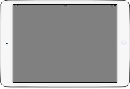
For the background on this video, I’m using a simple, almost white, solid color that matches my web site behind the devices. For other videos, such as the one I made for x2y, I used a wood texture to make it look like a desktop. You can decide which looks best for your particular app. Just be sure to use something that is perfectly flat to the camera’s point of view, so you don’t get issues with perspectives not matching. You can find lots of free background textures all over the web. Just be sure to get one that’s high-enough resolution, and make sure you have the rights to use it in your video.
How to Show Interactivity
One of the issues I came across when making the Fin video was how to show the interactions that would produce the animations on screen. For some apps, it’s no big deal to show movement without showing how that movement is triggered, but for an interface like Fin’s that features so much swiping and panning, I really wanted it to be clear how to make those events occur. What I ended up doing was superimposing a photo of a hand, which I then animated to match the screen action. More on how I did this later and why I felt it looked “good enough” to get the job done. But keep in mind if you want to show something similar for your app, this is an additional image (or images) you’ll need. And it’ll add to the complexity of your video.
In the next part of the series, we’ll look at assembling the different screen grab pieces with their device frames and animating them for effect.