The first big challenge in designing the iPad version of x2y was the placement of the controls. Looking at all that screen real estate, you are tempted to concentrate only on the visual aesthetic and forget that you want the design of the app to conform to the users’ hands as well his or her eyes.
This is why it’s essential when designing an app to mock it up and get it onto the device as early in the process as possible. Tap around and see how comfortable (or uncomfortable) all the controls are. (I use Bjango’s excellent Skala for this purpose.)
People hold the iPad very differently than the iPhone. It’s a two-handed device, for the most part. (Even the new iPad mini, while comfortable to hold in one hand while reading or viewing a video, is not very easy to operate with one hand. You tend to go two-handed when you need to start tapping things.) Placing the controls where they are easiest to get to, then, is essential.
I started with the number pad. The common solution to the number pad on the iPad is to place it at the center bottom, so that it’s equally reachable by either hand. Makes sense, after all, as this works perfectly for the keyboard. But since the number pad, unlike the keyboard, only takes up part of the width of the screen, I thought this placement would waste space and ultimately make it slightly uncomfortable for both hands, rather than perfectly comfortable for either one, as you have to reach out to get to the center of the screen. Considering that the main thing you need to do with x2y is change the values with this number pad, I wanted it to be as effortless as possible. This wasn’t working for me.

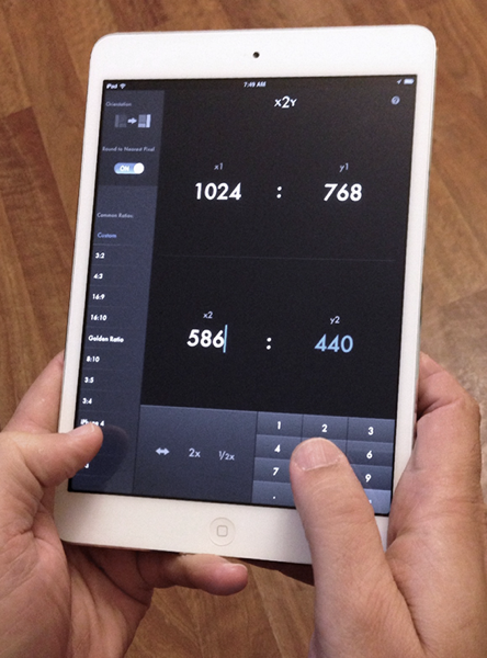
What if I place the number pad directly under the thumb? That way, you can type on the number pad without lifting your hands from the device at all. I mocked up the pad on the far bottom right, and immediately it felt perfect to use with the right hand. I knew this was a far better choice.

But what about those who prefer using their left thumbs? Being a southpaw myself, I’ve always been hyper sensitive to designs that don’t conform well to my preferences.
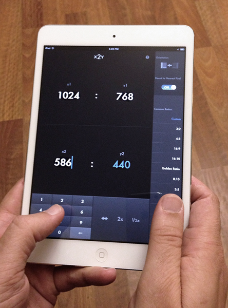
So I decided to add an orientation toggle. A simple button tap, and the entire layout of the app switches to an alternate, left-handed layout. The number pad moves to the left bottom corner, and the settings sidebar moves over to the right.

On first launch, the app assumes you favor your right thumb (a sensible default, as 90% of the world is right-handed), but once you set the orientation to your preferred side, the app will remember your preferred layout on future launches.
And this orientation preference works in landscape as well as portrait mode, of course.
This simple little change added more complexity for me on the backend. I ended up rewriting a lot of code to get two alternate views working properly. (Lots of AutoLayout debugging, too.) All for a switch that most users will press once and then forget. But every time I tap out a new value with my thumb, I’m reminded that it was totally worth it.
Meanwhile, adding the infrastructure to save that orientation preference made it trivial to save current field values between launches as well. So now, even if you haven’t launched the app in weeks, it’ll open up exactly where you left off, on both the iPad and the iPhone. A nice added benefit.
x2y is now a universal app for iPad, iPhone, iPod touch. You can get it here on the App Store. Or visit the web site for more details.